I would like to meet Leanne Shapton in real life and ask her a thing or two...How does she make the simplest text and images look so beautiful and lively? I love the way she can take everyday objects and simplify them just to the basic outline and color. She is a rockstar who is featured in the New York Times and does dozen of other collaborations including book covers. I would love to see her illustrations in the Seattle Times some day. It would simply brighten my day at first glance!
Wednesday, April 4, 2012
Home Girl Part 1
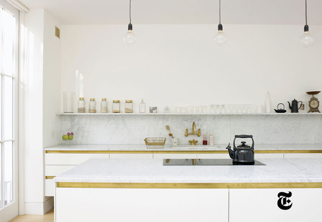
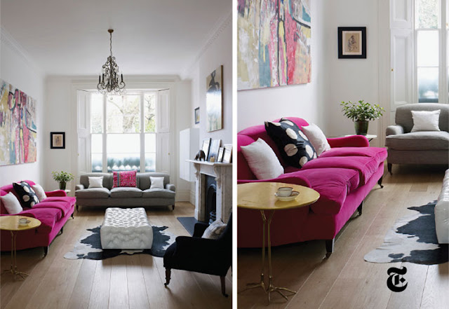
Even though I haven't blogged for months--some things never change. I will forever love a fresh white interior. It is the ultimate canvas for layering color & texture and really lets the furnishings become a work of art. I'm sure this home isn't new to some of you since it's been floating around the net (and featured in the spring Times Design mag) but this is the quintessential "d&f" kind of home! Love the strong graphic pops contrasting elegant light fixtures and just enough of color to brighten your spirits. Harriet Anstruther is most definitely a homegirl. Not just for her home but she also has work in the V&A, works directly with the London Design museum and all around has super rad taste! Cheers to you Harriet, keep up the good work!
Subscribe to:
Comments (Atom)


